Slide Gallery
A slideshow of photos, design options or deck slides, with an optional pick.
≈ 1,689 tokens per use (tool 824 · guidance 303 · typical payload 562)How token costs are estimated
Example: Slide Gallery
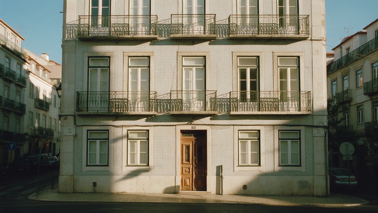
Show me photos of the apartment on Rua das Flores
Apartment on Rua das Flores
When to use
- The user wants to look through a set of images: listing or trip photos, product shots, design options, generated images.
- Previewing a short presentation deck slide by slide.
- The user is choosing between visual options: "which of these photos should I post?", "which logo concept?".
When not to use
- There's a single image. Put it in the reply.
- The items are records to compare by name, price or rating. Use an Entity Card.
- The agent doesn't have real image URLs. It must never invent or guess them.
- The content is a long document. Use an Article.
How the agent should use it
- Take every image
srcfrom a tool result or the host, never from memory. Only http(s) URLs anddata:image/(png|jpeg|webp|svg+xml)load; anything else shows "Image unavailable". - Write real alt text that says what the image shows. It's required.
- Keep captions short, a few words on one line. They support
**bold**and[links](https://…); add acreditwhen the source is known. - Use deck slides for deck previews: a headline, up to 6 bullets or one
stat, andnotesfor what the speaker says. - Set
selectiononly when the user is choosing, with a specificsubmitLabel(e.g. "Use this concept") andmaxwhen it matters. - Never set
autoplayunless the user asks for a slideshow.
Interaction
- Navigate with the prev/next buttons (shown on hover and focus, always on touch screens), a swipe, the thumbnails, or the arrow keys, Home and End once the stage has focus. Moves are announced politely: "Slide 3 of 12: Living room".
- Expand (the icon button in the header, labelled "Expand") opens a full-screen lightbox with the same controls. Escape or Close returns focus to the Expand button.
- Speaker notes are the one thing collapsed by default, like in a deck tool. They stay open as you move between slides.
- Autoplay advances every 5 seconds with a visible pause button. It pauses on hover and focus, and doesn't start for people who prefer reduced motion.
- Selection: each slide gets a Select toggle and its thumbnail a check mark. The footer counts the picks ("1 selected", or "Pick up to 2" for a limited multiple choice; a single choice's "Pick one" is read to screen readers only). Submit is disabled until one is picked, and
maxis enforced. "None of these" ends with "None selected". - Streaming: slides append as they arrive. The stage shows a placeholder until the first slide is complete, and the counter reads "1 / …" until the last one lands.
Installation
npx shadcn@latest add https://your-site.com/r/slide-gallery.json
Usage
import { tool } from "ai"
import { slideGalleryTool } from "@/components/genui/slide-gallery.schema"

const tools = {
  [slideGalleryTool.name]: tool({
    description: slideGalleryTool.description,
    inputSchema: slideGalleryTool.inputSchema,
  }),
}
With selection: "none" the gallery is display-only, so give the tool an execute that returns immediately. With "single" or "multiple", the agent receives one of:
{ action: "select", slideIds: ["leaf"] } // in slide order
{ action: "dismiss" } // "None of these"
With LangGraph
Push it from a graph node with ui.push({ name: "show_gallery", props: { toolCallId, ...args } }, { message }), and render the thread's UI messages with the Renderer.
Restoring from history
When a conversation is reloaded, pass the stored result back as result. The gallery restores the pick (check marks and the footer) read-only and never calls onResult again, so a choice can't be sent twice. With the AI SDK, that's the tool call's output:
<SlideGallery
  {...part.input}
  result={part.state === "output-available" ? part.output : undefined}
/>
Schema
| Prop | Type | Notes |
|---|---|---|
title | string? | e.g. "Apartment on Rua das Flores" |
aspect | "16:9" | "4:3" | "1:1" | "3:4" | Default 16:9 for decks, 4:3 for images. Images are letterboxed, never cropped |
selection | "none" | "single" | "multiple" | Default "none" (display-only) |
max | number? | Most picks with "multiple" |
submitLabel | string? | Submit button text when selecting |
startIndex | number? | Zero-based slide to open on |
autoplay | boolean | 5 s per slide. Default false |
slides | Slide[] | 1–30 slides, below |
An image slide is { type: "image", id, src, alt, caption?, credit? }. src and credit are data-bound.
A deck slide is { type: "deck", id, title, subtitle?, bullets?, notes?, stat? }, with up to 6 bullets and stat as { value, label }.
Host props: status (streaming, ready, selected, dismissed), onResult, result and className.